Leadersport store in Russia
with more than 30 000 items
with more than 30 000 items
About project
Leadersport chain of stores has been on the market of goods for sports and outdoor activities for 10 years. The format of the stores corresponded to the concept - "sport should be accessible".
Extensive trading experience, but weak identity
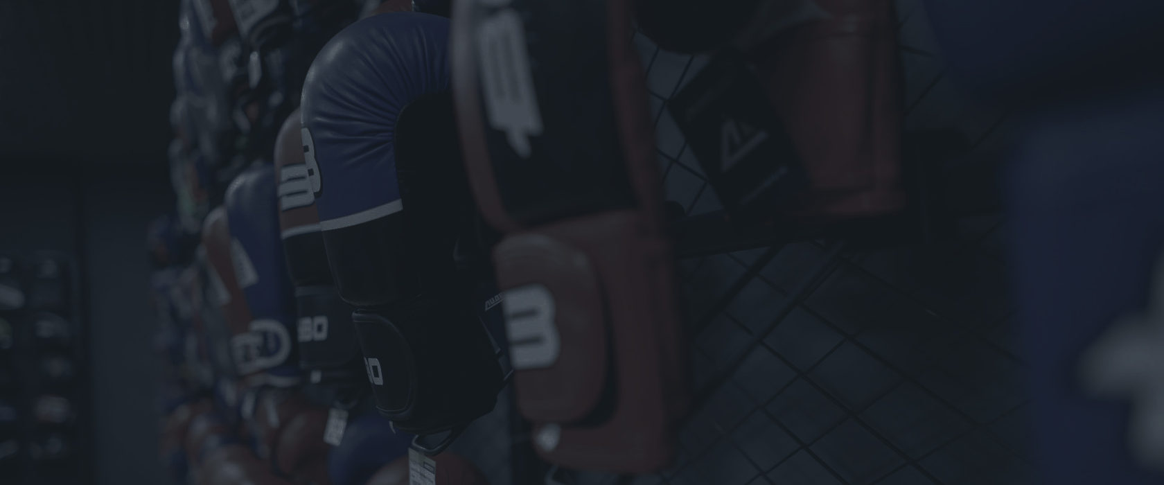
Before redesign
During the creation of a new large store, it was decided to create
a new Profi format for more demanding customers and athletes.
Where products of more professional brands would be presented.
a new Profi format for more demanding customers and athletes.
Where products of more professional brands would be presented.
Before
After
Before
After
The simpler the better
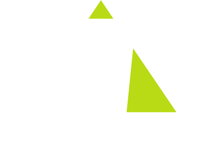
Logo redesign
Leadersport Profi store logo consists of the signand the text part.
The logo is based on the letter "L", which forms the silhouette of
a triangle with a dynamic line.
The logo is based on the letter "L", which forms the silhouette of
a triangle with a dynamic line.
Before
After

The logo mark can be placed on different media where
logo placement is not suitable..
logo placement is not suitable..

Elements of identity are presented on all major media
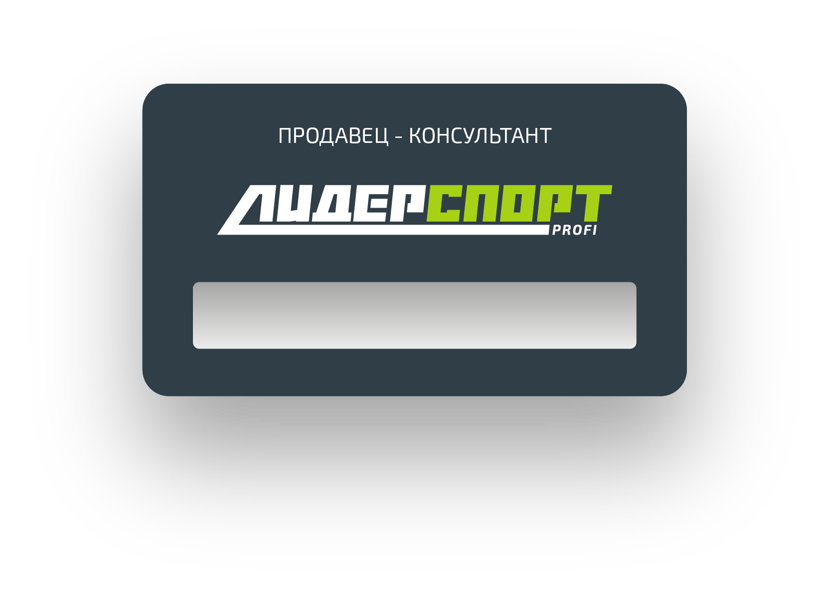
Bearers of identity
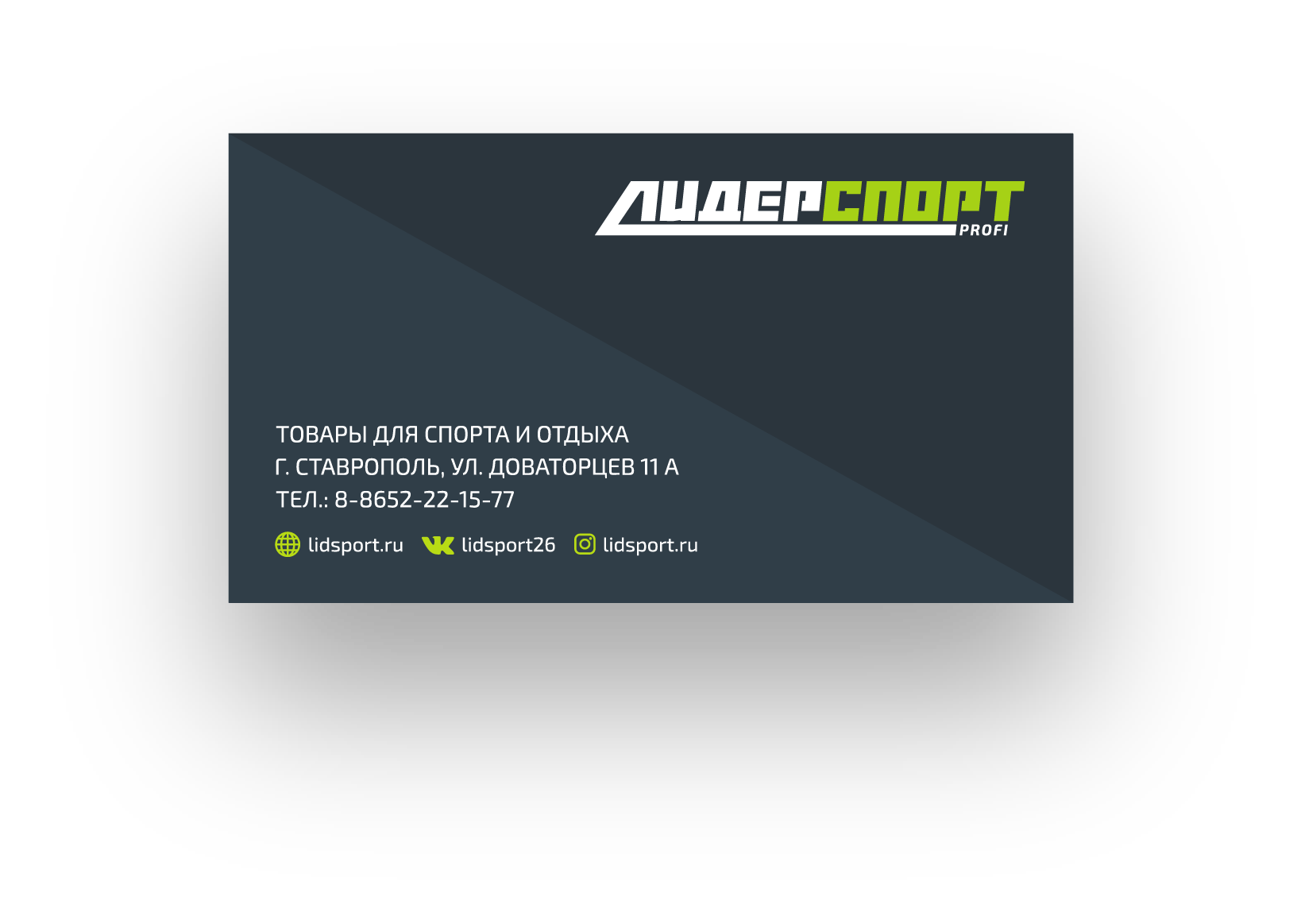
Business Cards
Badge
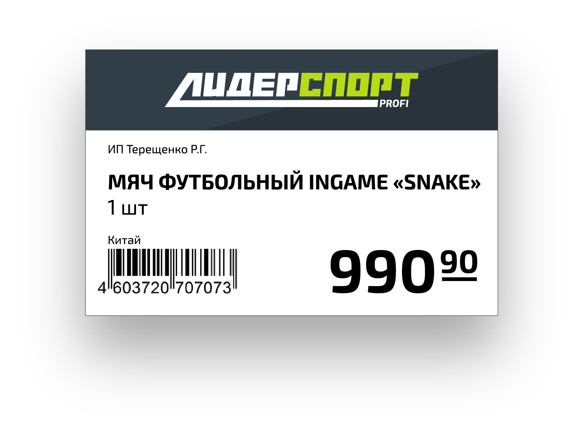
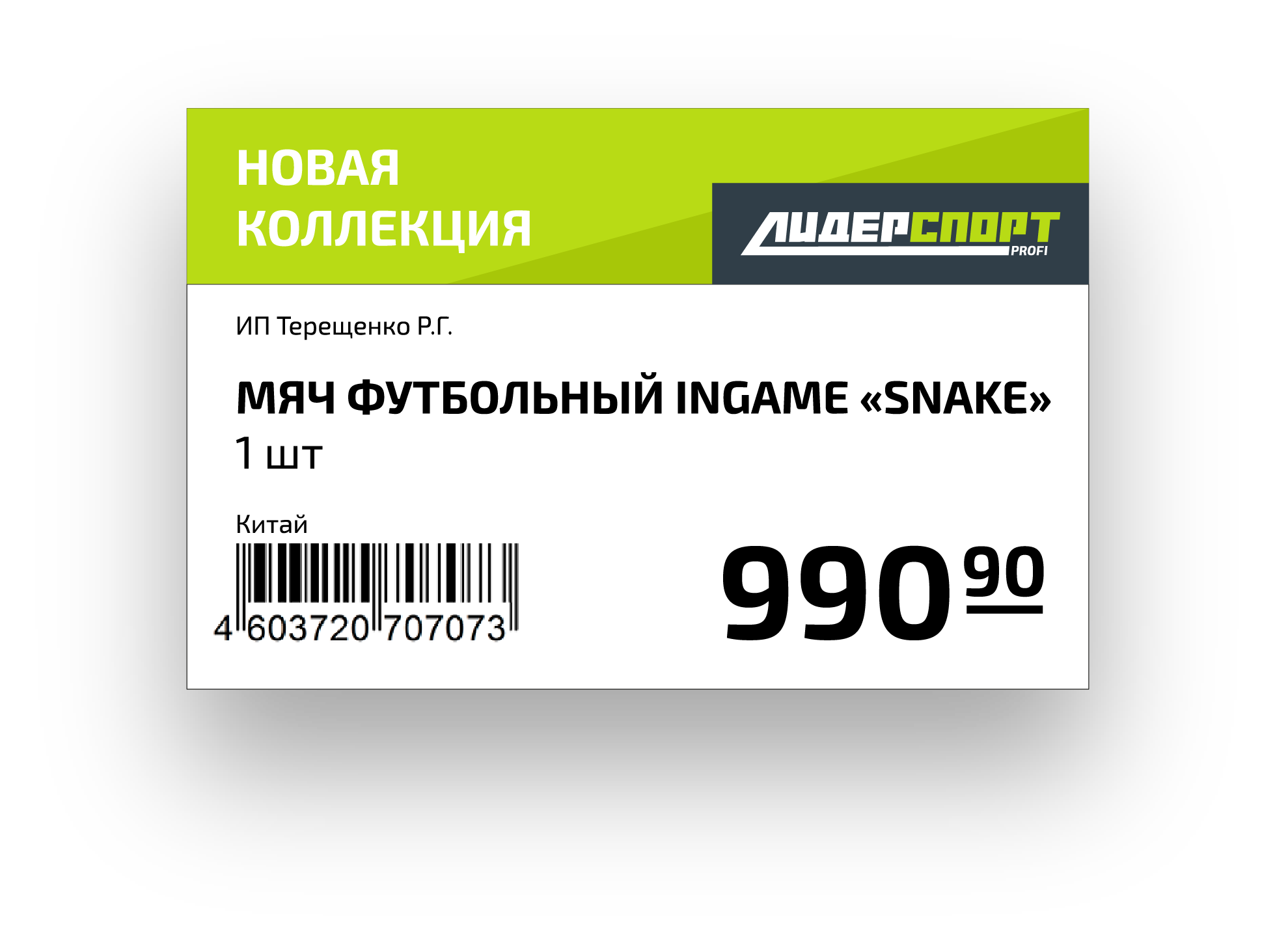
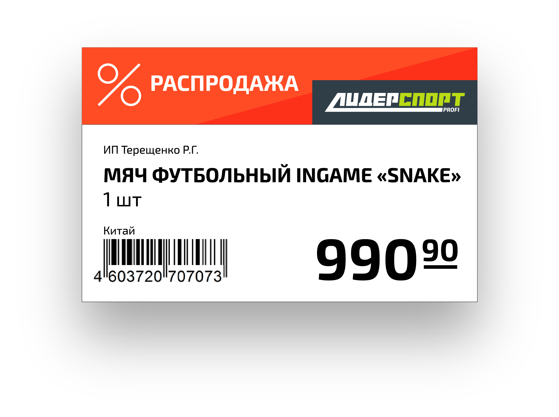
Price tags

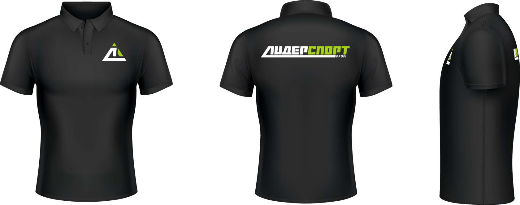
Corporate polo shirt
Redesign of means of visual communication in the interior
interior elements
promotional pointers to the ceiling
navigation signs for zones by sport
pointers to zones by sport
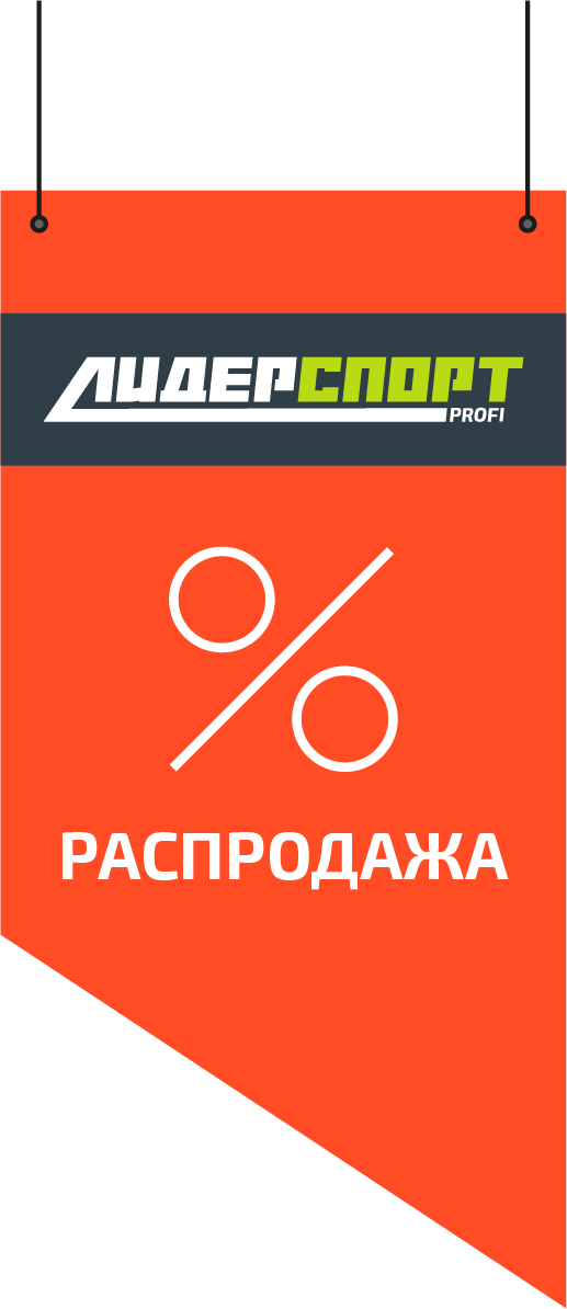
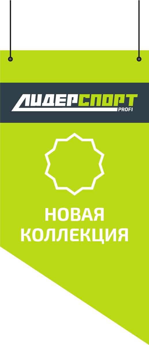
flags
interiors elements


Design of new facades signs reinforced the new format
advertising elements
facade signs
bilboard 3x6
posters on the facade windows

Typography
Typeface for typesetting business documents and promotional
materials - Exo 2.0.
materials - Exo 2.0.


Regular
Italic
Bold
Black
Thin


Colors
The main brand block uses 2 colors. One shade of light green
and one shade of gray. White is used when placing the logo
on a gray background.
and one shade of gray. White is used when placing the logo
on a gray background.
CMYK 40/0/93/0
#C1DA34
RGB 194/218/52
CMYK 79/61/49/50
#394049
RGB 57/64/73
UIARTMEN@GMAIL.COM


+7 911 120 18 65
